30 Best Thumbnail Examples for YouTube Videos in 2023
May 5, 2023
A thumbnail is one of the key things you need to consider when you plan to create a YouTube video. You should always create a thumbnail that relates to your video content as well as act as clickbait to grow your YouTube channel.
Since YouTube allows you to upload custom images as your thumbnail, you should leverage the opportunity so that your audience finds your channel relevant and interesting enough.
Studying and evaluating successful examples of YouTube thumbnails is always a good option before you dive into the world of video creation.
In this article, I have listed the best YouTube thumbnail examples that will help you get inspiration for your next YouTube video.
Importance of a Custom YouTube Thumbnail
Here are the top benefits of customizing YouTube thumbnails for your videos:
- Gives your audience a glimpse of your video content, whether it is relevant and interesting enough for them or not.
- Grabs the attention of the audience while they are scrolling through YouTube.
- Builds a unique brand identity for your channel.
- Builds curiosity and promotes action from YouTube users to click on your content.
30 Thumbnail Examples for Inspiration in 2023
Here are the top 30 YouTube thumbnail examples for your videos:
Claudia Ayuso
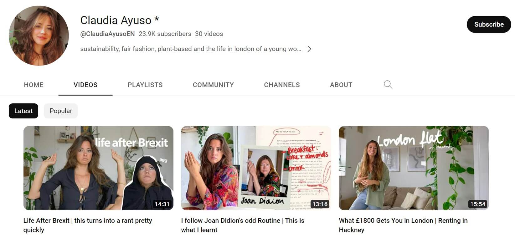
Claudia Ayuso is a digital content creator and author whose videos are generally themed around the environment, sustainability, and human rights issues. Her YouTube channel has over 24K subscribers with just 30 videos.
One of the key reasons for her YouTube success is the use of optimized, engaging, and personalized thumbnails to generate more views.
The video thumbnails follow a consistent style of using high-quality real images of the actual video content in the background and stylish white-colored text overlay.
Claudia ensures she includes herself in all her thumbnails, making the channel more convincing and "human-like".
Following a similar design pattern for thumbnails on all her videos builds a connection with her audience. Also, it makes the channel more recognizable.
Hootsuite
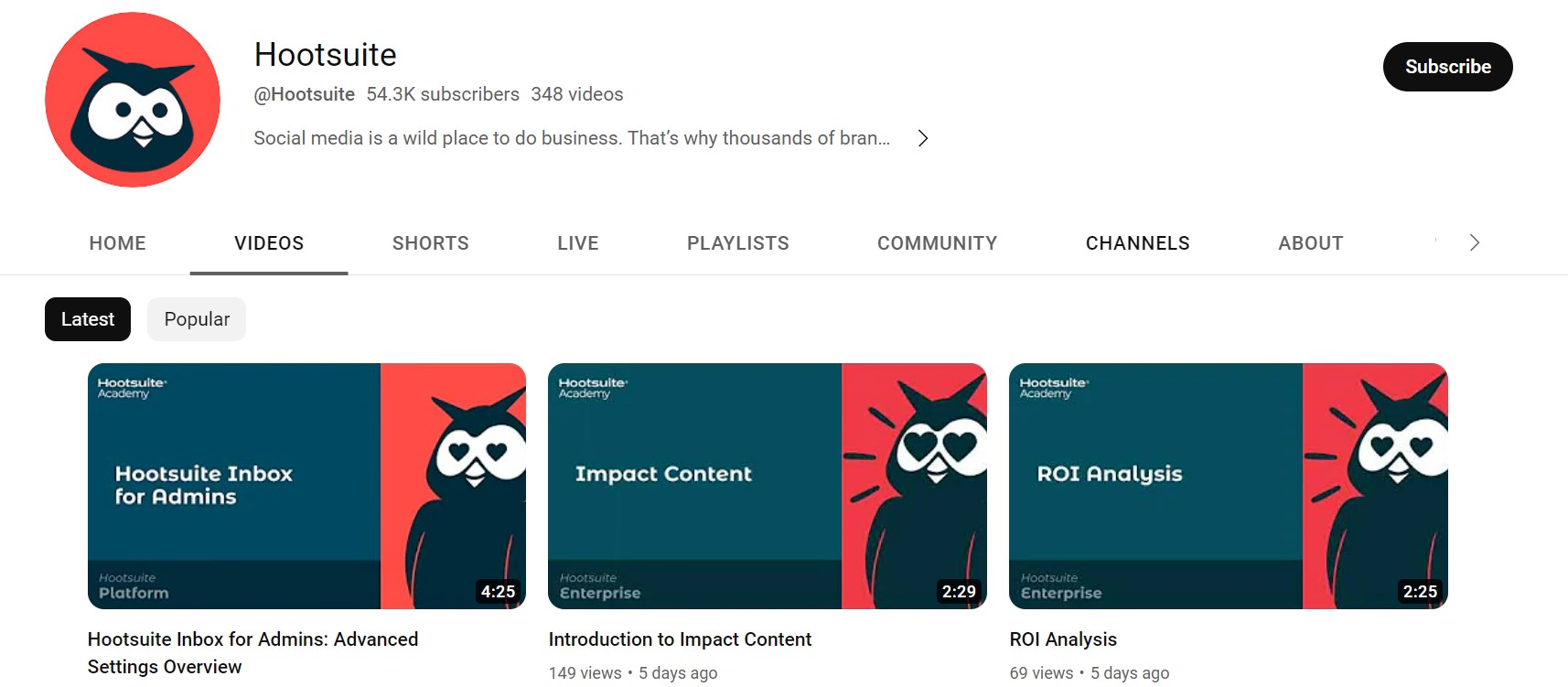
Hootsuite is a leading social media management platform that has a successful YouTube channel with over 53.7K subscribers and 343 videos. The channel constantly uploads videos educating viewers about various aspects of social media.
Besides offering educational content, another intriguing factor that makes it a popular channel is the theme, style, font, and text of the thumbnails.
The thumbnails of the channel are well labeled, with a clear glimpse of what the viewers will get by watching the video. The fonts used for the thumbnails are simple and emphasized to convince viewers that the main content is undoubtedly useful.
All the thumbnails are well-optimized with contrasting and catchy color schemes to draw viewers' attention. The majority of the thumbnails use color designs of blue and pink or yellow and blue that also align with their website colors.
Also, the website logo is used in the thumbnails so the viewers remember the brand.
Think Media
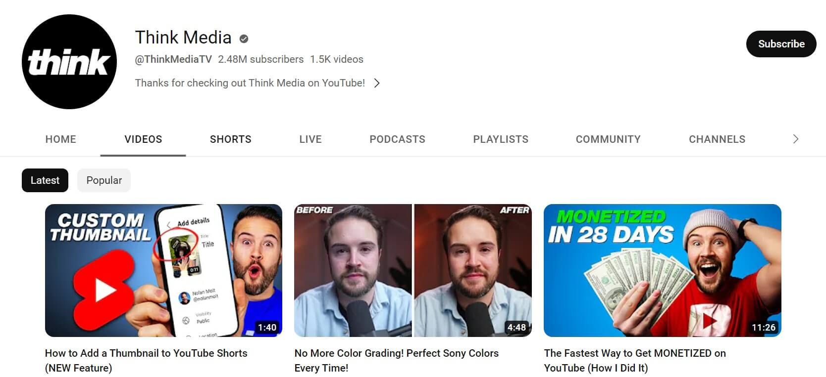
Think Media is a verified YouTube channel with over 2.4 million subscribers and 1.5K videos. The channel consistently delivers content based on technology and YouTube growth. It also creates valuable tutorials on various gadgets.
The USP of the thumbnails of Think Media is the clever use of facial expressions to draw viewers’ attention. The ball goes in the court of the viewer to guess what the video has in store for them based on the expressions used in the thumbnail.
The title, text, and graphics used in the thumbnail create curiosity among the viewers to watch the entire video.
The Futur
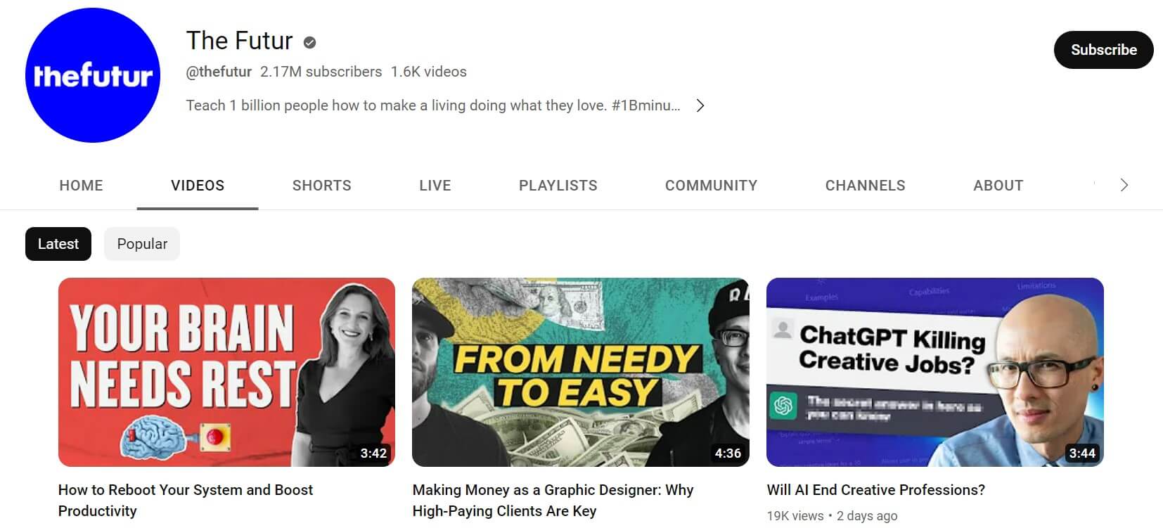
The Futur is a verified YouTube channel with over 2 million subscribers and 1.5K videos focusing on various topics, including marketing, money, business, stocks, and mindset.
One of the key attractions of the channel’s videos is the thumbnails it creates. The bold and emphasizing fonts instantly catch users’ attention.
Besides this, the overlay text is catchy, minimal, and simple enough to give the viewers explicit instructions about what the video is about.
All the thumbnails include the use of human faces and expressions to attract more viewers and improve the channel's credibility.
The color scheme of the thumbnails in all the videos is diversified and "poppy" to highlight the overlayed text.
Alux.com
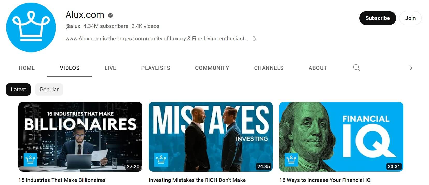
Alux.com is one of the top YouTube channels for money-making and money-management content. It has over 4.3 million subscribers with 2.3K videos.
The channel is consistently growing, and one of the reasons could be its enticing thumbnails. All the thumbnails include the company’s logo to make the viewers remember the brand whenever they are looking for educational courses, podcasts, and articles related to money matters.
Alux.com makes perfect use of font overlay by creating brand-aligned text. The channel uses a mix of animations and human images to make the videos look creative and engaging for all age groups.
PewDiePie
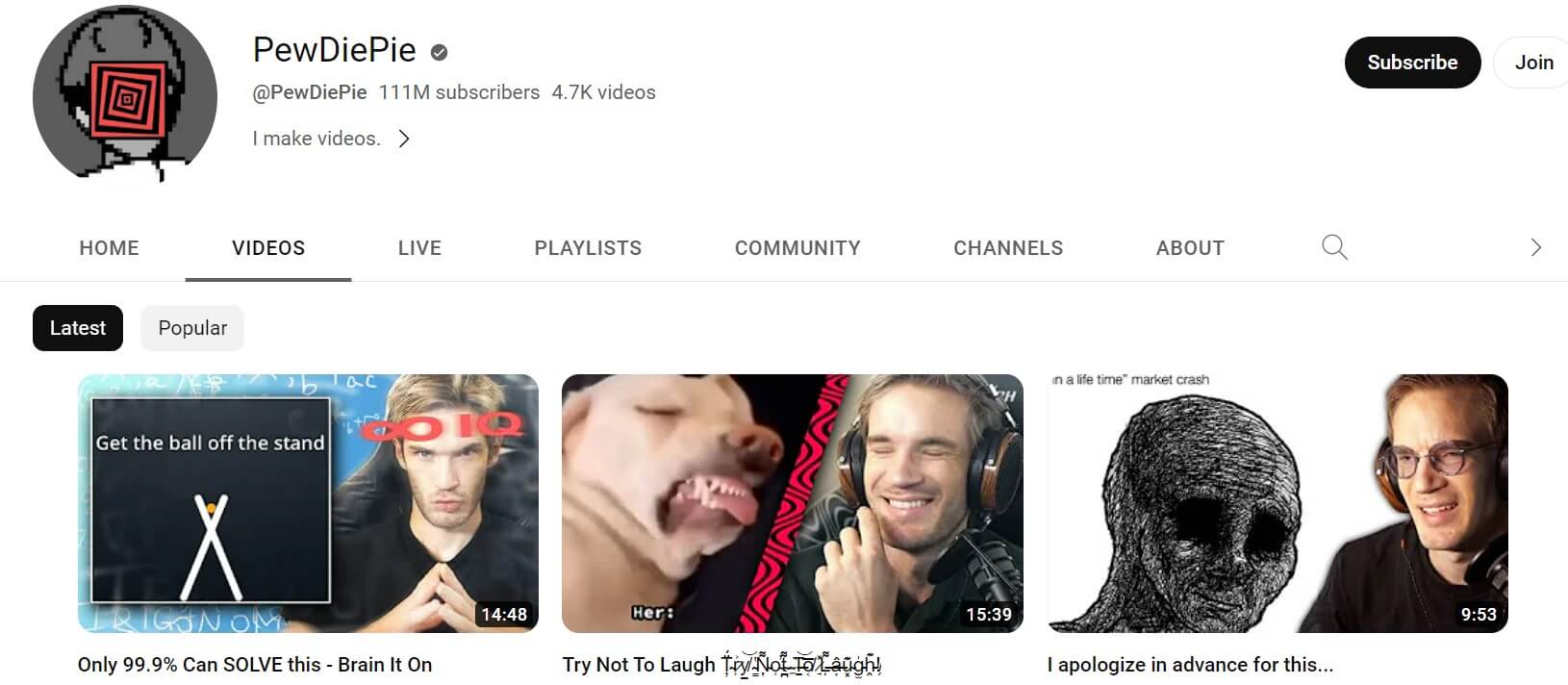
PewDiePie is among the first channels on YouTube to get subscribers in millions. Currently, the channel has around 111 million subscribers with 4.7K videos. The videos on the channel include funny gaming commentaries, play-along, and daily vlogging.
The thumbnails used for the videos use a perfect mix of the YouTuber's face, funny graphics, memes, poppy colors, celebrity images, and interesting texts.
Other than creating funny video content, PewDiePie constantly tries to keep the video thumbnail as funny as possible.
Neil Patel
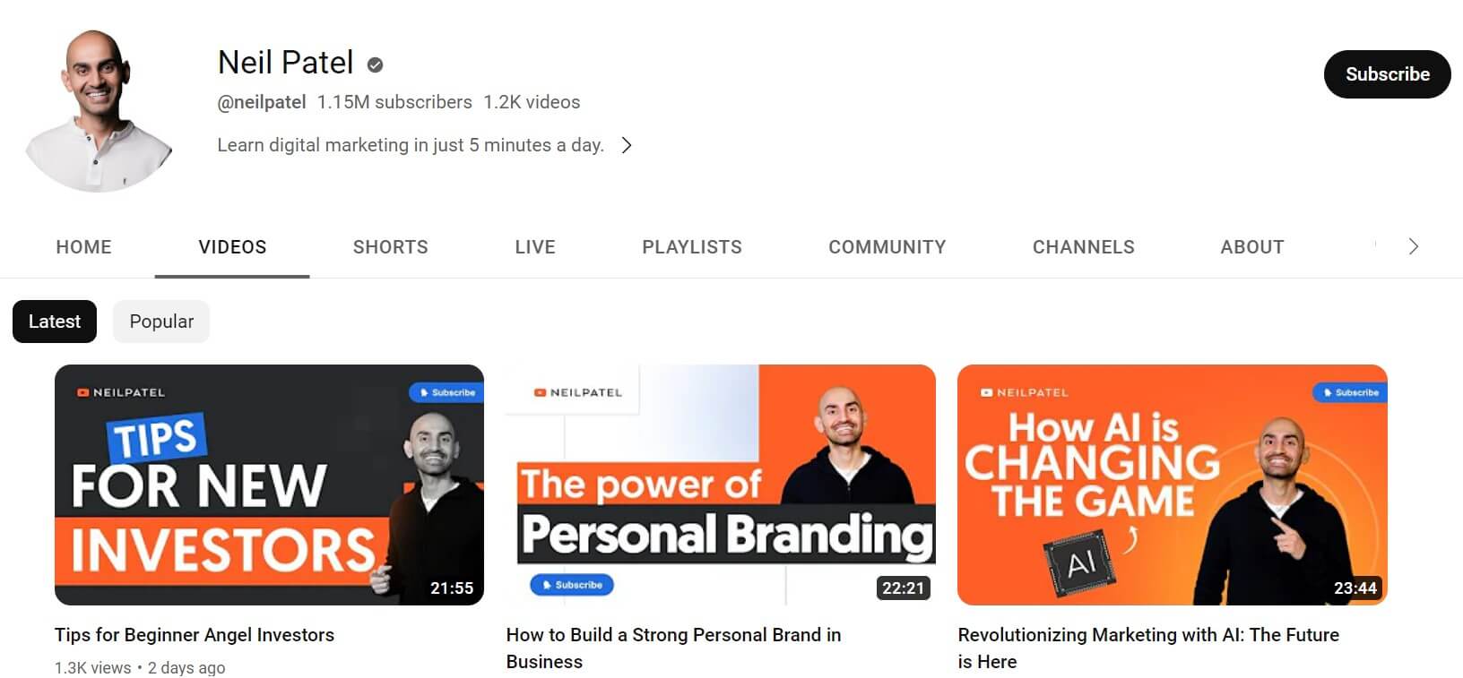
Neil Patel is a digital marketing expert who consistently offers to deliver educational content on topics like SEO, websites, and business in the form of videos and articles. His YouTube channel is as popular as his website, with 1.1 million subscribers and 1.2K videos.
Most of his video thumbnails use the color scheme of orange and yellow similar to his website. This strikes a chord with the target audience and makes the brand memorable so the viewers stay loyal to it.
Many thumbnails on the channel feature the brand owner himself. This plays a massive role in driving viewers to the video because it builds a sense of trust among the audience.
To make the thumbnail interesting, Neil Patel uses a variety of facial expressions based on the relevancy of the content.
The thumbnail image of all the videos is highly optimized with enough white spacing and minimal font.
It also includes content aligning graphics and images. For instance, if the video is about social media strategy, the thumbnail contains logos of top social media platforms. Despite adding graphics and fonts, the thumbnail looks uncluttered and clean.
Target
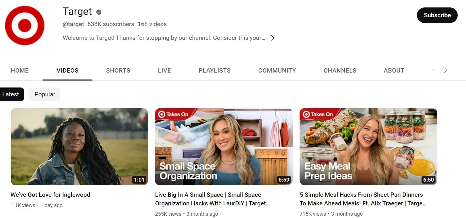
Target is a large retailer in the United States. Their channel features lifestyle-related content on beauty tips, food recipes, and fashion.
The thumbnails of this channel instantly draw viewers’ attention with high-quality background images and the creator’s cheerful faces.
The font size and style are easy to understand. Audiences can get an idea of the contents of the video simply by looking at the text and images used in thumbnails.
Other content creators and celebrities who get featured in any of the videos have their images included in the thumbnails of the videos with overlay text so the audiences know exactly what they will be watching.
Cut
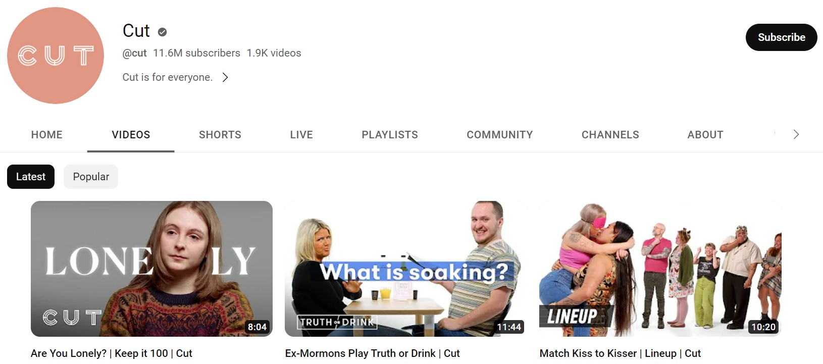
Cut is a leading YouTube channel that answers various small questions, the channel has a massive fan following of approximately 11.5 subscribers with 1.9K videos.
The thumbnails of the videos are the actual images from the middle of the video with funny texts or excerpts of the chat between the host and the audience.
Since the images used in the thumbnails are authentic, it builds curiosity among the audience to know the whole truth of the video.
Leadpages
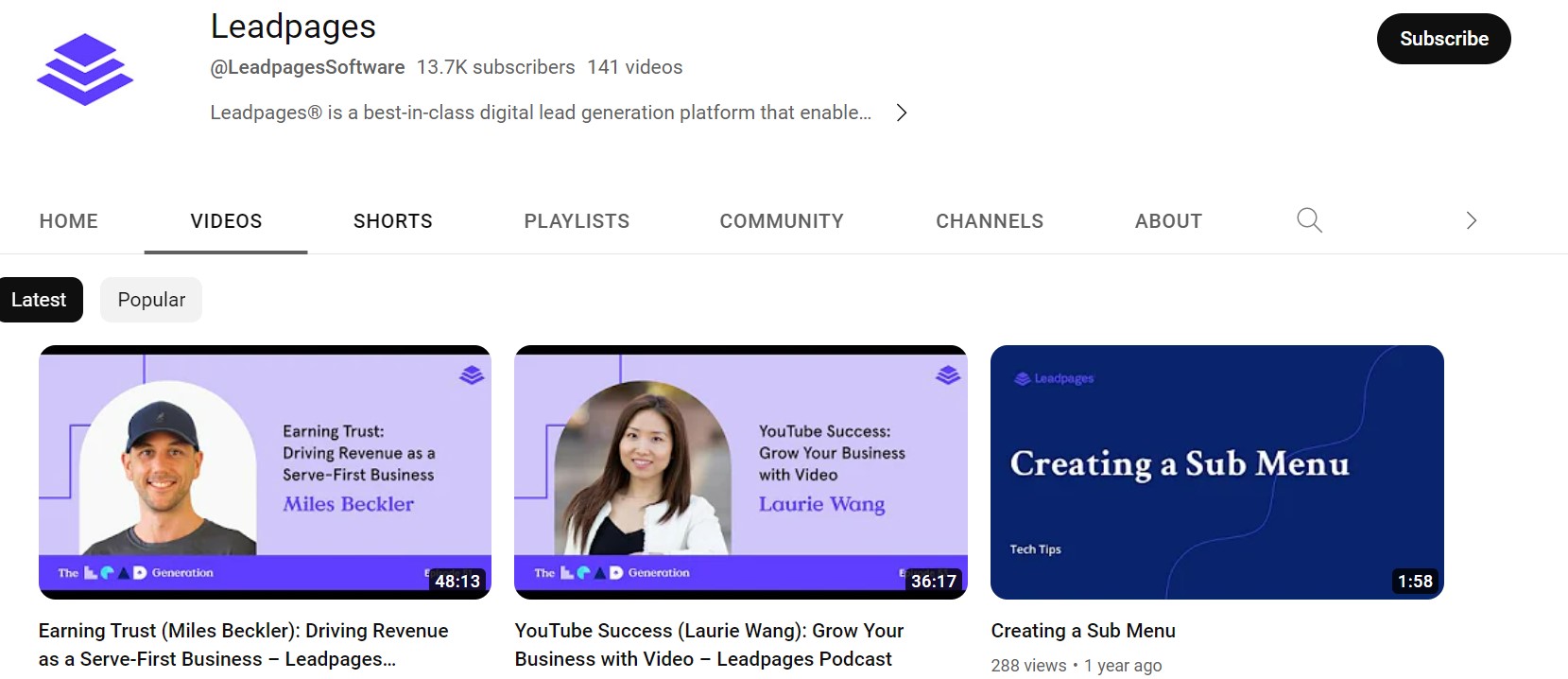
Leadpages is one of the top lead-generation platforms for marketers and businesses. Their YouTube channel is all about educating businesses on how to grow sales and generate more leads.
All thumbnails of the channel use contrasting backgrounds and texts like blue and white or orange and white.
The channel goes for a minimalistic design with the brand logo and title of the video. It uses a straightforward approach to inform readers about the video.
Asian Boss
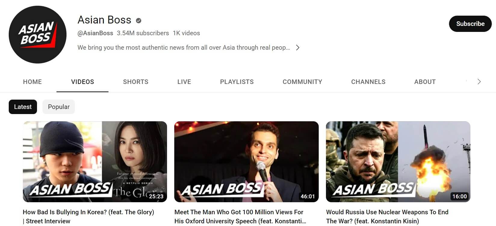
Asian Boss is an Asian news channel that takes views of real people from all over Asia. The channel has over 3.5 million subscribers with 977 videos.
Since the channel is interview-based, the thumbnails include an image from the interviews, which makes the channel more relatable and authentic for the audience.
Another eye-catching element of Asian Boss’ thumbnail is mentioning the channel name in bold and large font over the image.
Mr.Beast
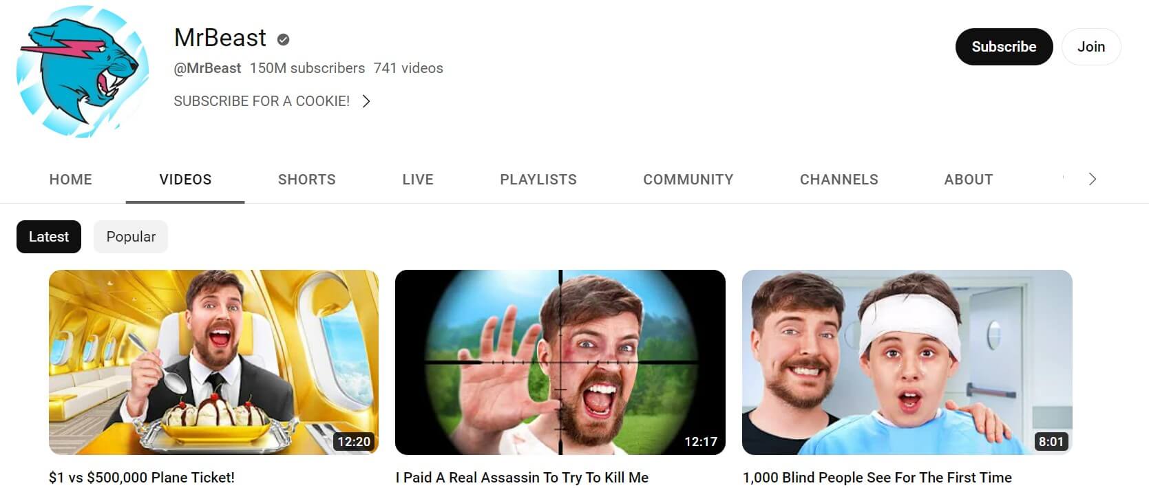
Mr. Beast is one of the most subscribed YouTube channels, with over 145 million subscribers and 738 videos. The videos on the channel are focused on performing expensive stunts.
One of the key USPs of this channel is the intriguing thumbnails that show animated representations of the main character and the stunts he performs.
Besides the vibrant cartoons in the thumbnails, the usage of extravagant and enthralling expressions attracts viewers to the channel.
The creator also includes his friends, peers, and even celebrities in his thumbnails to build a personal connection with the audience.
PinkFong
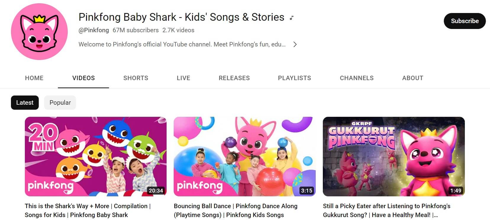
Pinkfong is a leading South Korean children’s channel that offers a variety of educational content in a fun and engaging way. The channel has a massive fan following of 66.7 million with over 2.7K videos.
Since the channel is created for kids, the theme of the thumbnails of all the videos is animated and child-centric.
The cartoon characters used are brightly colored and happy to attract young children. The thumbnails also feature their brand name in the bottom left corner to help parents and kids recognize the brand name in the future.
The channel educates young children about climate change, animal saving, and nursery rhymes. The animated characters used in the thumbnails are creative, contextual, and child-friendly.
Sephora
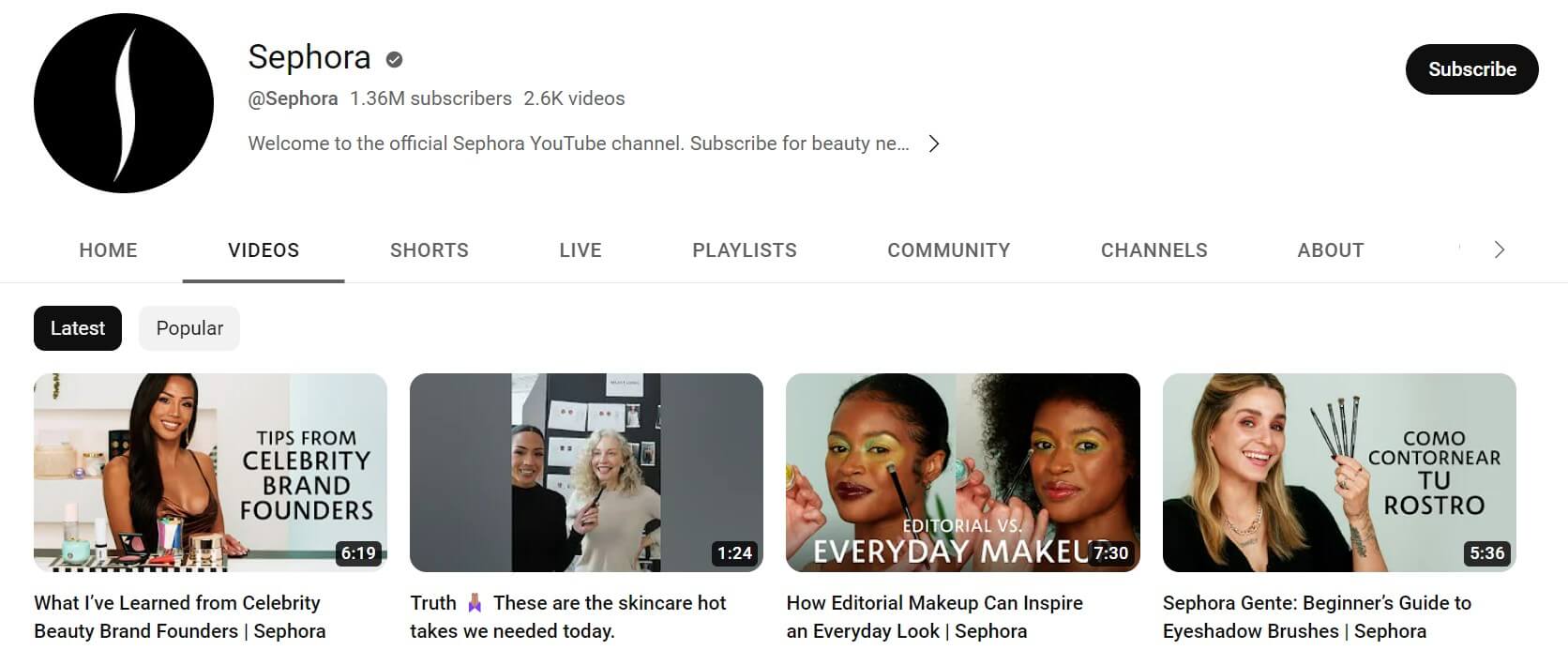
Sephora is a leading make-up brand with a massive fan following on all social media channels, including YouTube. Its subscribers on YouTube have reached over 1.36 million with 2.8K videos.
Their thumbnails focus on the products and feature various people associated with the brand, including the founder, marketing team, and other employees.
The colors used in the thumbnails are incredibly subtle, including nudes, pinks, and whites that align with the brand's theme.
The brand also focuses on leveraging human faces in the thumbnails to give a personal touch to the videos.
Jamie Oliver
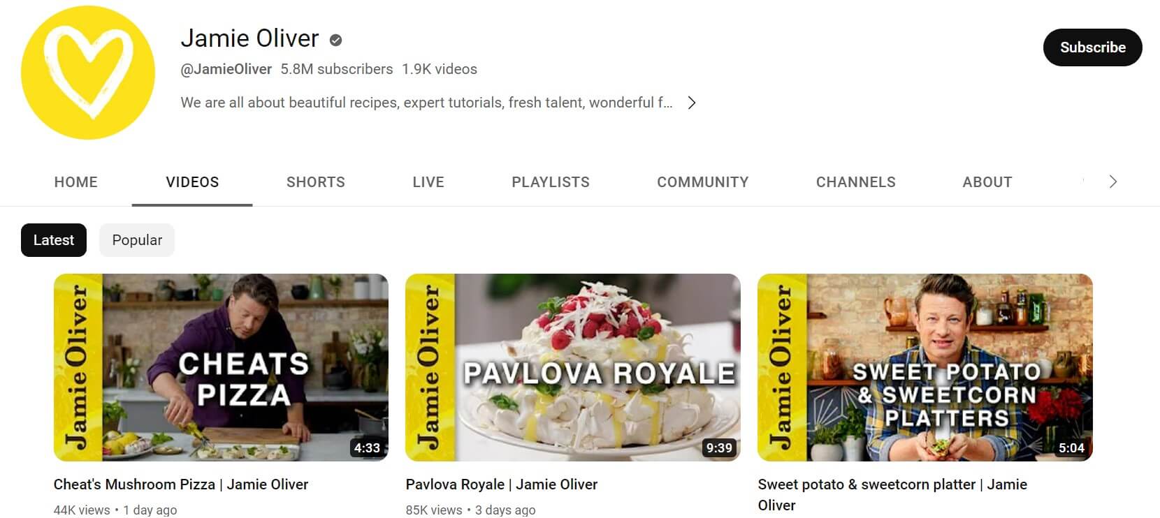
Jamie Oliver is a leading YouTube channel with over 5.7 million subscribers and 1.9K videos and has a compilation of mouth-watering recipes, collaborations, and food tips.
The theme and logo of the channel are bright yellow, which is included in most of his videos. All his thumbnails are straight, simple, yet appealing.
All his thumbnails include his name vertically placed with either a yellow or green colored opaque textbox. Besides featuring himself in the video, the chef ensures that all the thumbnails include his face, which is one of the key factors that attract and make the audience trust the channel.
The celebrity chef also features a lot of Michelin star and popular chefs from all over the world and ensures that the presence of the guests is depicted in the thumbnail itself.
Vlad and Nicky
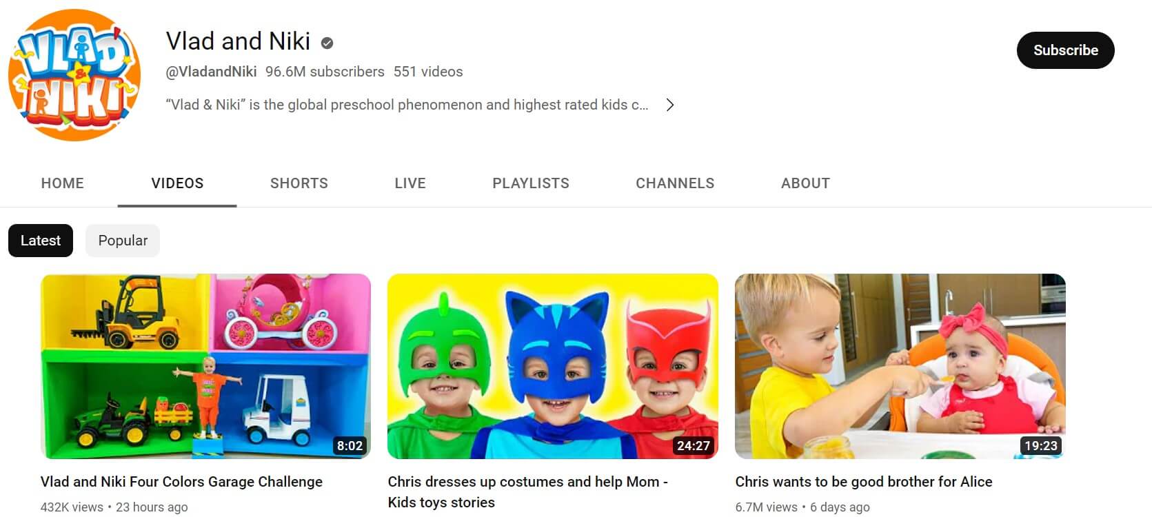
Vlad and Nicky is a kids' channel about two brothers, Vladislav Vashketov and Nikita Vashketov, who perform various day-to-day activities and adventures in their videos.
The channel features kids and is specifically created to entertain children. Hence the thumbnails are designed in a way that attracts young kids. The characters’ clothes, toys, text, and backgrounds used in the thumbnails are colorful, eye-pleasing, and attention-grabbing.
Children are attracted to bright colors like blue, orange, and pink. They are used so the target audience is instantly convinced to watch their video.
The cute young kids also use various facial expressions, including happy, surprised, sad, and curious, to catch tiny kids’ attention.
Since the channel creates kids’ content, there is minimal or no use of text in the thumbnail, as children rarely pay attention to written content and are more driven toward graphics and cartoons.
Tasty
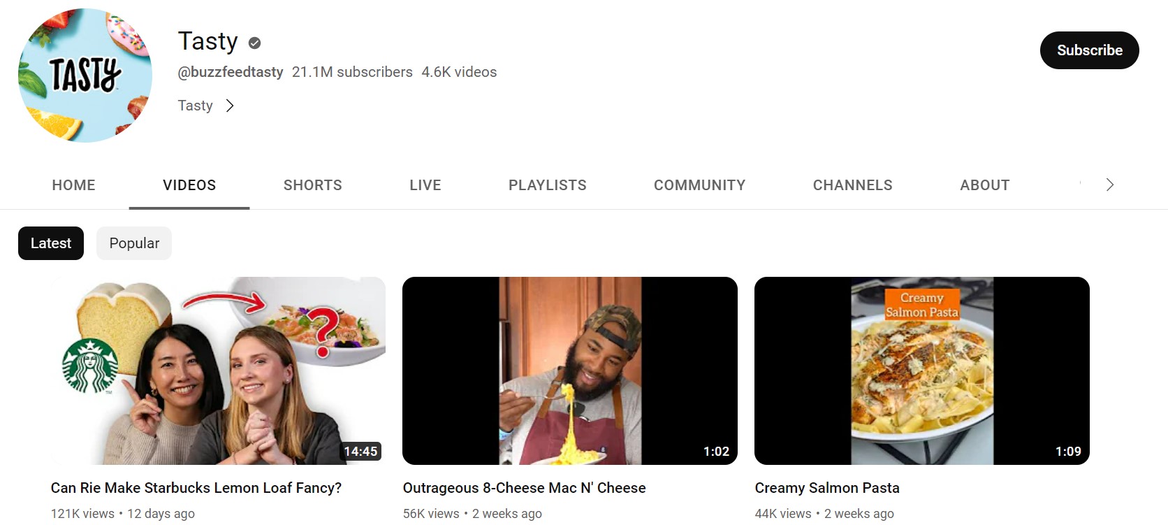
Tasty is a leading YouTube channel with over 21 million subscribers and 4.5K videos. It uploads content on food, recipes, and cookware.
Since the channel is focused on food, all the thumbnails include appealing and delicious pictures of food discussed in the video. The pictures used in the channel’s videos are genuine and authentic rather than stock pictures.
Additionally, there is hardly any background editing, even if it exists, it's minimal yet eye-catching. Also, the text used in most thumbnails is glowy, bold, and attention-seeking.
The human touch in the thumbnails is leveraged effectively to increase the total subscribers and viewership of the channel.
Shopify
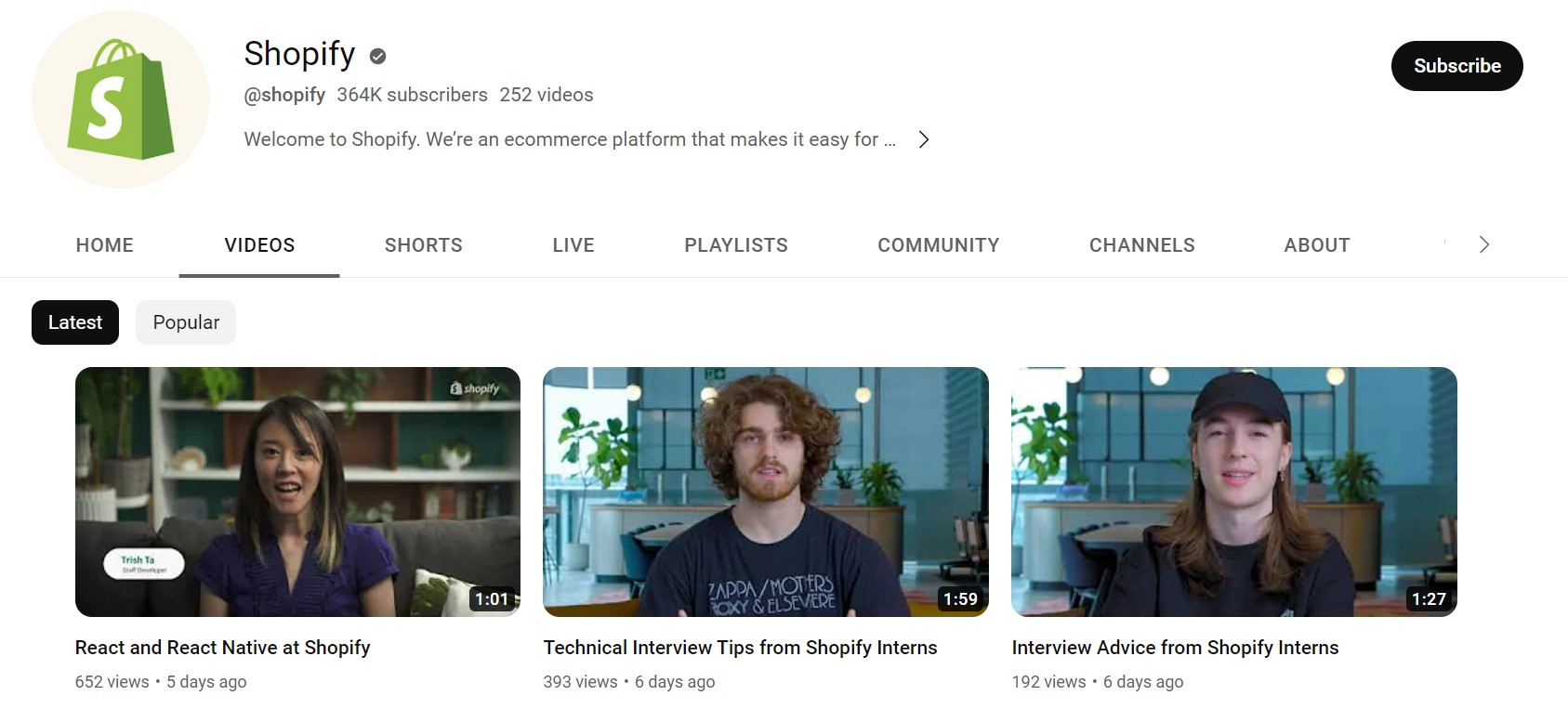
Shopify is one of the top online brands that help marketers and businesses get educated through blogs and videos on various ecommerce related topics.
The website’s YouTube channel is also massively successful, with over 361K subscribers and 239 videos.
Since Shopify constantly discusses better user experience, all their video thumbnails are well-optimized. A consistent pattern of thumbnail design is followed for each category of videos.
The videos that discuss various marketing tactics and have bright-colored backgrounds with strong and emphasized text. It includes clear text, such as boosting conversions.
Additionally, the thumbnails feature the face of a team member of Shopify talking about the topic in the video.
Ahrefs
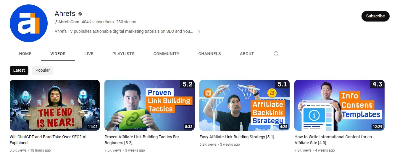
Ahrefs is one of the top SEO platforms providing many resources to educate businesses about various marketing tactics through insightful videos and informative blogs. Their YouTube channel has almost 400K subscribers with 279 videos.
One of the top factors in the channel's popularity is the consistent design of its thumbnails.
Since the website of Ahrefs is based on an orange and blue theme, all the text of the thumbnails uses similar color and font styles as the website to maintain the consistency of the brand.
Ahrefs’ video creator consistently uses a mix of human expressions to engage viewers. The thumbnails also use innovative graphics and logos in the background to add a creative touch to the video.
Marshmello
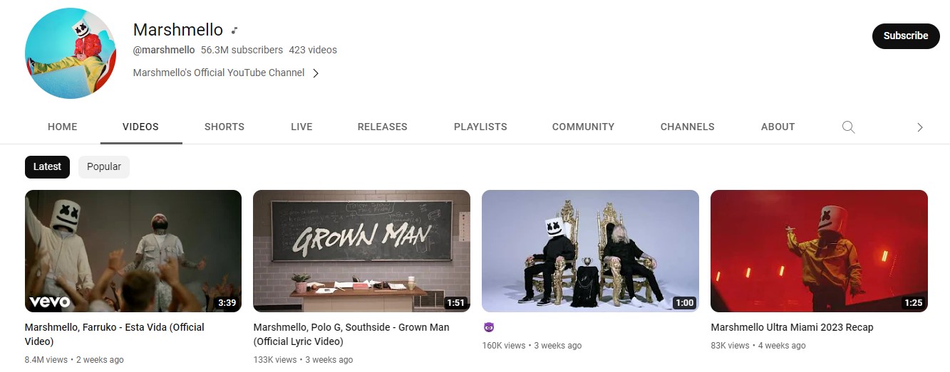
Marshmello is an American DJ and music producer with a YouTube channel of over 56.2 million subscribers and 421 videos.
His video thumbnails are effortless and include excerpts from his music videos.
Also, the creator makes sure that the excerpt portrays the USP of the musician, his mask in each of his thumbnails.
The Financial Diet
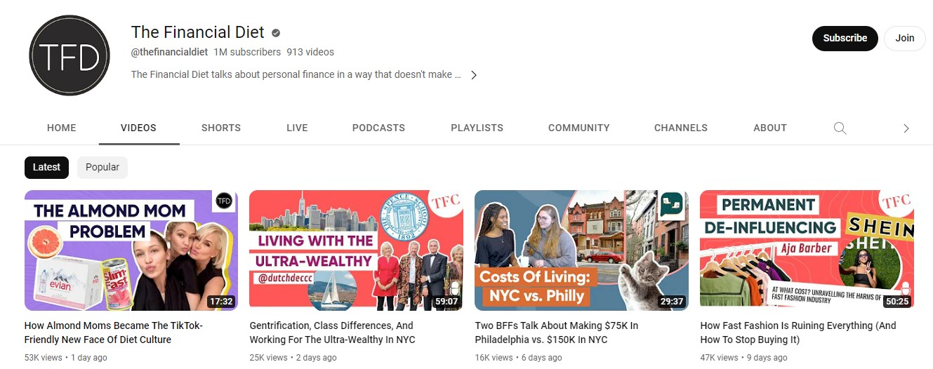
The Financial Diet is a leading personal finance YouTube channel with over 1 million subscribers and 889 videos.
The channel is also famous for its attractive and engaging thumbnails. The channel’s thumbnails break the concept of minimalism. The channel has cluttered thumbnails with a perfect mix of text, graphics, human faces, and bright colors.
The graphics and photographs are highly relevant to the video topic and give a clear idea of the video content.
5-Minute Crafts
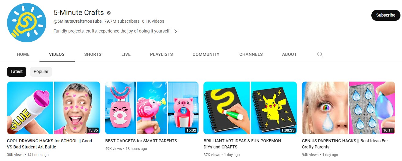
5-Minute Crafts is an exciting art channel with 79.6 million and 6.1K videos. It provides viewers with tips and tricks on various innovative DIY projects.
Since thumbnails give the viewers the first glimpse, 5-Minute Crafts has very well understood what interests their audience.
There is significantly less use of text, yet the thumbnails can easily tell the essence of the video very clearly. It's probably because of the comparative images of right and wrong or before and after that tell audiences how a simple DIY art will turn out.
The DIY acts performed in the videos are extraordinary and unique. Hence, the results are equally enticing that instantly catch users’ attention.
The channel's target audience is children, and the colors used are perfect for them. Be it bright pinks, lush greens, or vivid glitters, the colors work well to attract young kids.
Yoga With Adriene
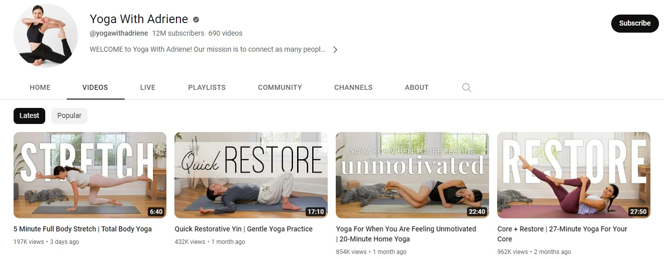
Yoga With Adriene is a fitness YouTube channel with 11.9 million subscribers and 689 videos. The channel focuses on providing health insights and teaches the viewers yoga.
The channel's host is Adriene, who makes sure that she features herself in all the thumbnails with a particular yoga posture from the video.
The look of all the thumbnails is clean and appealing. The color schemes used are extraordinarily subtle with soothing pastels matching the yoga theme.
The white spacing and text are ideally used in the thumbnails. The text is vertically placed in the center of the thumbnail with a clear picture of the host wins it for the audience.
The text delivers a clear message of what the video is about and clearly states the duration of the yoga session, giving the audience an idea of how long the session will be.
Ali Abdaal
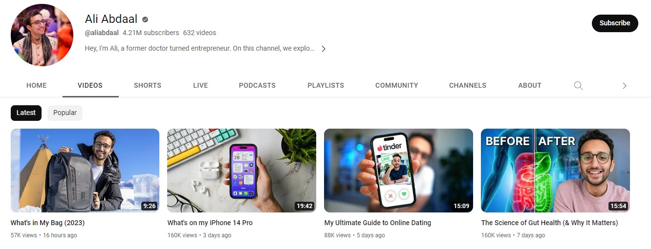
Ali Abdaal is a doctor and entrepreneur who runs a leading YouTube channel with over 4 million subscribers and 614 videos. The channel talks about various life hacks and valuable life tips.
His channel is exciting, and the thumbnails are even more enjoyable. Ali features himself in all the thumbnails with happy and exciting expressions.
The use of graphics, text, and props is relevant and innovatively used in all the thumbnails to give the viewer a glimpse of the video.
Ali Abdaal breaks the monotony of using a solid background, and most of his thumbnails are filled with high-quality images or his actual background (mostly his home), giving an authentic impression to the viewers and an aesthetic turn to the thumbnails.
Kids Diana Show
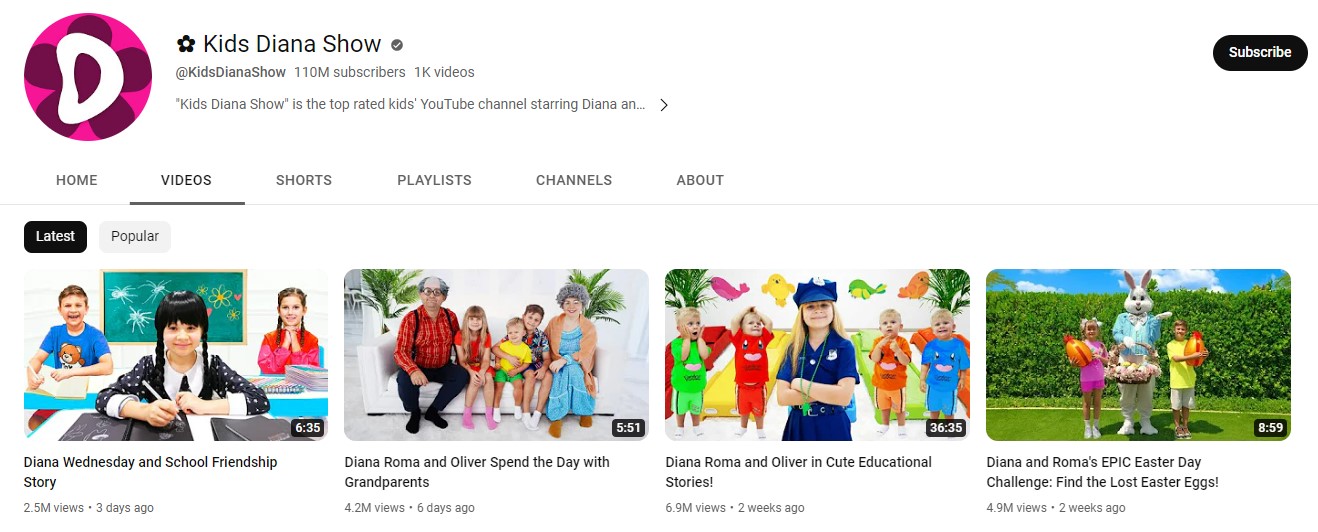
Kids Diana Show is one of the top YouTube channels, with over 110 million subscribers with 1K videos. The channel is based on two young kids’ daily activities, fun adventures, and playful acts.
The thumbnails of their videos look fun and enticing for kids to open and watch. All the thumbnails feature the show hosts with a representation of what they are up to in that particular video.
A lot of thumbnails include their friends and family. The toys and props they use are also eye-catching. Also, both the kids use friendly and happy expressions in the thumbnails to attract young kids to their videos.
Brooker Films
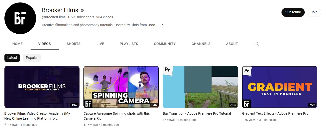
Brooker Films is a filmmaking and photography tutorial channel hosted by Chris. The channel has over 108K subscribers with 964 videos.
Since a professional photographer hosts the show, most of the thumbnails feature the show host performing photography-related actions.
The thumbnails depict the tutorials' before and after effects, giving a clear picture of the video content.
The thumbnails also have special effects with little exaggerated edits that would induce curiosity among the audience and want them to watch the whole video.
HopeScope
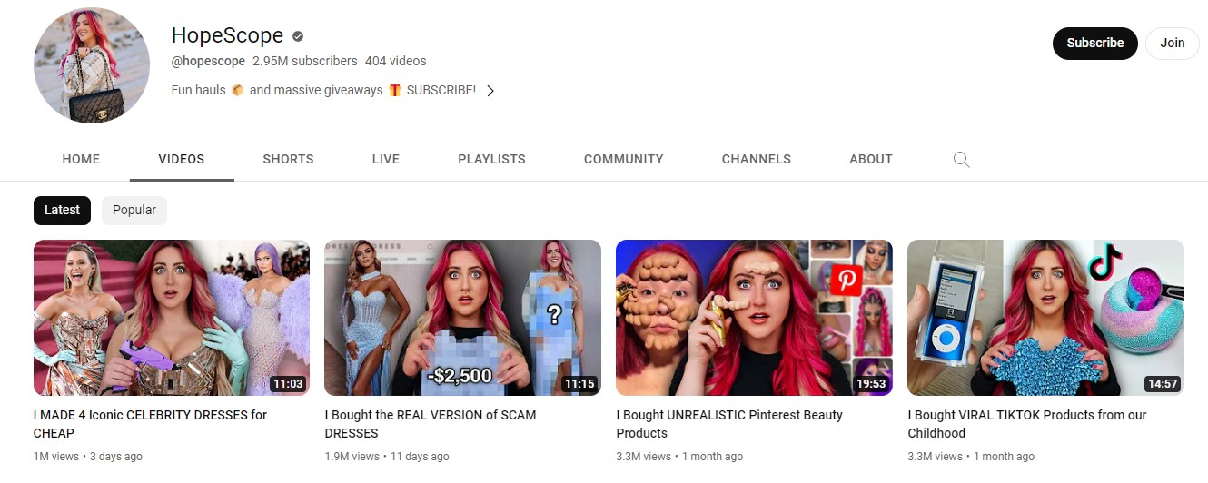
HopeScope is a top fashion and clothing haul channel with over 2.8 million subscribers and 401 videos. One of the key highlights of this channel is its host and creator, Hope Allen, who constantly keeps the viewers engaged and entertained.
Another highlight of the channel is the engaging and hilarious thumbnails. It includes animated and 3D versions of the video creator with humorous and captivating expressions and props.
The props she uses in the thumbnails are replicas of the products she uses in her hauls and tutorials.
Allen also invites various content creators and guests in her videos and includes them in the thumbnails for better reach and audience engagement.
Freddy My Love
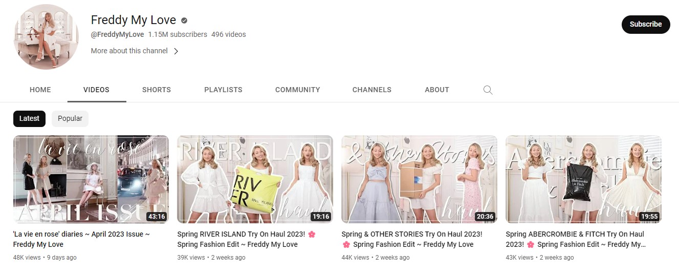
Freddy My Love is a London-based fashion vlog. The channel has almost 1.1 million subscribers and 488 videos.
Besides providing insights and fashion tips, the channel elaborately focuses on its thumbnails to draw viewers' attention. The theme of the thumbnails is aesthetic, and the pastel colors are pink, blue, and white.
The overlay text of all the thumbnails is bright white and compliments the image. Besides being in the video, the channel host also features herself in the thumbnails with the pretty dresses she wears in the video and the respective brand’s shopping bag.
Amy Landino
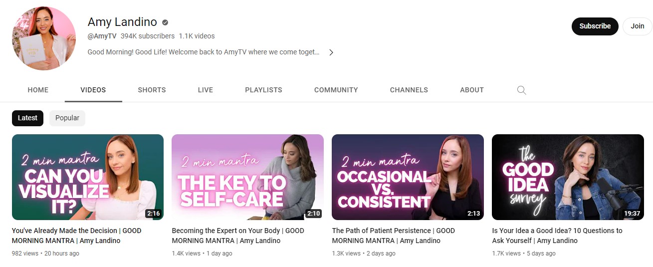
Amy Landino is one of the top fashion authors and influencers. The award-winning fashion influencer also runs a YouTube channel with over 394K subscribers and has 1.1K videos.
The thumbnails of her videos are simple yet appealing to the audience. All the images of thumbnails are bright and high-quality. It features the channel host with various appealing backgrounds and graphics, including rooms, cars, and cafes.
The text of the thumbnails is bold and bright in order to emphasize the topic of the video. It's clear from the thumbnails and the background what the channel host is up to in the videos.
James Charles
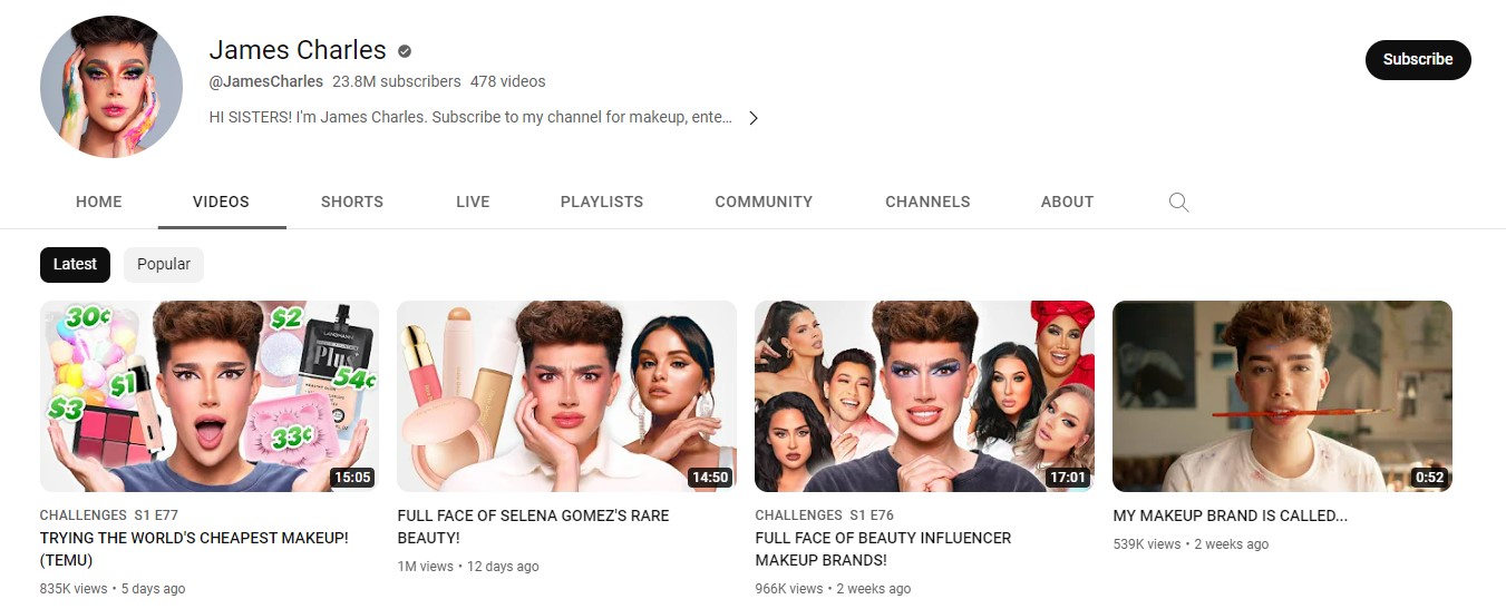
James Charles is one of the top beauty influencers running a successful YouTube channel with 23.8 million subscribers and 478 videos.
One of the key reasons for his popularity is his exceptional makeup skills, extravagant expressions, and innovative thumbnail designs. All his videos include himself with makeup and props.
Most of his thumbnails are humorous and attention-grabbing, essential in engaging the target audience.
When the influencer replicates another celebrities’ makeup, he also includes the picture of the example in the thumbnail.
What Makes a Good YouTube Thumbnail?
Here are the top elements that make an attractive YouTube thumbnail:
Simplicity
Minimalism works best when creating a YouTube thumbnail since it is a small image of your video. T design and layout of the image should be as simple and uncluttered as possible so the viewers don’t get confused or overwhelmed.
Keep the text of the image to a minimum with easy readability. Five or fewer words in total works best for the thumbnail.
Add Contrast to Your Thumbnail
Using a suitable color scheme for your thumbnail is one of the essential elements to gain viewers’ attention.
Using similar colors throughout the image can be boring. By using contrasting colors like black and white or yellow and blue, you'll make your image look lively and clear.
Add a Text Overlay to Your Thumbnail
Adding relevant yet straightforward text to your image provides context to the viewer. Focus on using interesting and compelling words in your thumbnail text since this will prompt action.
You can also include keywords from the title of your video in the thumbnail to give the viewer a glimpse of your video.
Select the Right Font for Your Text Overlay
A consistent and easy-to-read font for your thumbnails is important. It is essential to communicate your brand message or the introduction of your video to the audience clearly and precisely. You can try experimenting with unique font styles like bolding or italicizing specific areas of the text that you want to highlight more.
Elicit an Emotional Response Using Faces
Human faces and expressions connect better with your audience as it builds a sense of trust and acts as a sign of authenticity.
Remember Brand Consistency
Maintaining consistency all over your branding, be it website, social media platforms, and YouTube, is necessary as it helps audiences to recognize your videos and brand easily.
Keep certain things similar, like the brand's logo, color schemes, or font style, in all your thumbnails, as this helps audiences identify your videos better.
Conclusion
The YouTube channel examples discussed in the above article are among the top in their niches for a reason. One of the reasons for this is their catchy and attention-grabbing thumbnails.
These channels have incorporated all the essentials to grab viewers' attention, including leveraging minimal design, bold and stylish fonts, human expressions, and consistent branding.
To make your channel popular and attract viewers, you should evaluate the above-listed examples closely and incorporate these tactics along with your unique ideas to increase your viewership and subscriber rate.
